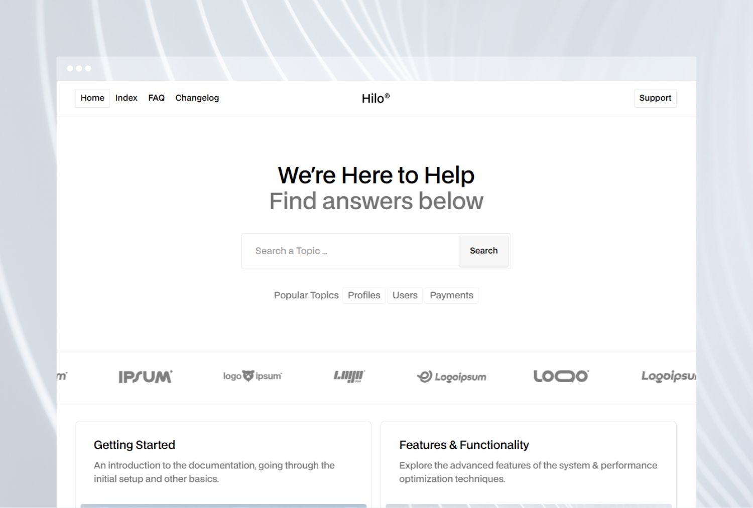
Updated Navigation Design
Redesigned the sidebar and breadcrumbs for easier navigation.

Minor Visual Adjustments
We’ve refined several small design elements to make the Help Center more consistent and pleasant to use.
What Changed
This update includes a series of visual and layout improvements across multiple sections of the site. Our goal was to create a more balanced and readable experience without altering the overall design language.
Here’s a quick overview of what’s new:
- Improved button spacing for better alignment and touch interaction.
- Refined typography in article headers and navigation links to enhance readability.
- Updated color palette for secondary elements, ensuring better contrast in both light and dark modes.
- Optimized sidebar layout to make browsing categories and subcategories more intuitive.
Why It Matters
Small details add up to a smoother user experience. These refinements reduce visual noise, create clearer hierarchy between sections, and help readers focus on the content itself.
Looking Ahead
We’re continuing to polish the Help Center design with accessibility and usability in mind. Future updates will focus on improving keyboard navigation, refining animations, and enhancing search discoverability.

